Brand your charts
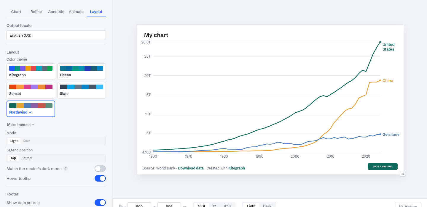
This is the chart from Make your first chart carrying a different identity: a custom palette, a brand accent, and a logo in the footer. Nothing about the data or the layout changed; the account's branding did.
Branding in Kitegraph is set once at the account level and carried by every output format. The controls live on the Visualize step's Layout tab.
Themes
The Color theme picker has four Kitegraph presets and a wider set under More themes, each tuned for both light and dark mode. A theme covers the palette, the accent, and the chart's surfaces, so switching restyles the whole chart in one click.
Your own theme
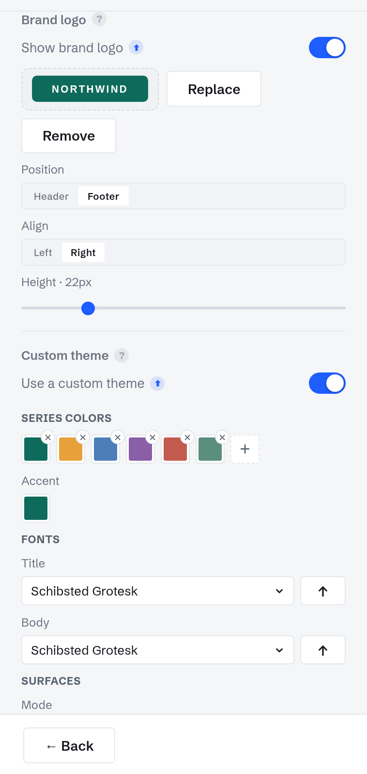
Custom theme (included on Professional) stores your palette, accent, title and body fonts, and optional surface colors on the account. It appears as a named card in the theme picker of every chart; picking it recolors the chart to your identity.
Fonts come from the Google Fonts catalog or your own uploaded font files, served by Kitegraph itself, so embeds and video renders never depend on an outside font host.
Your logo
Brand logo (Professional) places your mark on the chart: header or footer, left or right, at the height you choose. It is stored on the account and applies to every chart at once; the Show brand logo toggle turns it off globally without deleting the upload.
Light and dark mode
Every chart has a light and a dark rendering of the same design; the preview toolbar switches between them. Publish in either, or enable Match the reader's dark mode and the embed follows the page it lands on. Image and video exports keep the mode you authored.
Branding on every output
Embeds, share pages, MP4 and GIF renders, PNG, SVG, PowerPoint, and PDF all bake the same theme and logo. The chart at the top of this page is published proof: the tutorial chart, republished from an account carrying the Northwind identity, with nothing re-applied by hand.