Annotate and animate
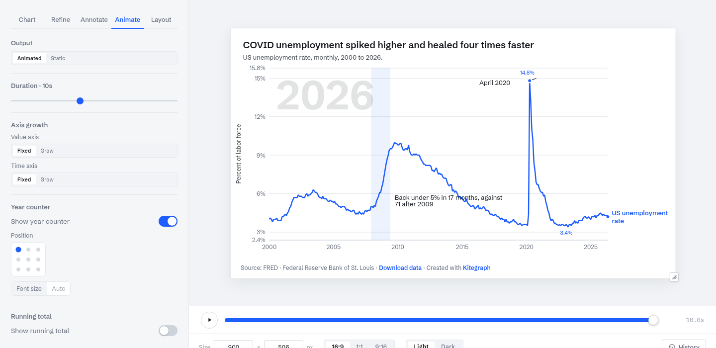
This guide adds the explanation layer to a chart: a note, a shaded period, an event pinned to a data point, and an animated reveal with a year counter. The chart is the US unemployment rate since 2000, and the annotations carry the finding:
Annotations in Kitegraph are baked into the chart, so they render identically in the editor, the embed, the video, and every image export. Everything below lives on the Visualize step's Annotate and Animate tabs.
Text notes
+ Add annotation places free text on the chart, dragged to wherever it reads best. The note here carries the comparison the title makes: back under 5 percent in 17 months, against 71 after 2009. A note can also take a connector, a leader line drawn to the point it explains; both ends drag in the preview, and what you drag is what publishes.
Highlight ranges
+ Add highlight shades a band of the time axis between two dates. The band here marks the Great Recession (December 2007 to June 2009, the NBER dates). Bands sit behind the data and read as context rather than commentary; on value axes, the same tool marks a target zone or threshold.
Timeline events
An event is different from a note: it pins to a data point, a date on a series, rather than to a spot on the canvas. The event here anchors April 2020, and its dot sits on the line at 14.8 percent. Because the anchor is the data, the event stays on its point when the axis rescales or new months arrive. The label position still drags freely; the leader follows.
The Animate tab
Switching Output from Static to Animated gives the chart a reveal: the line draws itself in over the duration you set, and a transport appears under the preview to scrub it like a video. The annotations join the choreography. The band fades in as the sweep reaches it, the event's leader draws and its label types out when the playhead hits April 2020, and every annotation has a Reveal slider to time it manually.
- Duration. This chart uses 10 seconds; most read well between 4 and 8.
- Axis growth. Either axis can expand with the data during the reveal instead of standing at its final extent.
- Year counter. A large, muted readout behind the data that follows the playback; positioned from a nine-point grid. The 2026 in the chart above is the counter at rest.
- Running total. The same readout summing every series at the playhead, for charts where the total is the story.
Render parity
The preview, the published embed, the MP4 and GIF renders, and the still exports all draw from the same definition frame by frame. Timing set against the transport is the timing everywhere the chart goes.
Publish
Publishing works as in Make your first chart. The chart at the top of this page is this chart, published: it plays its reveal once when scrolled into view, and its data keeps updating with the BLS releases.